pitch-book-layout-final-print-2
Process in Illustrator:


Final
Description:
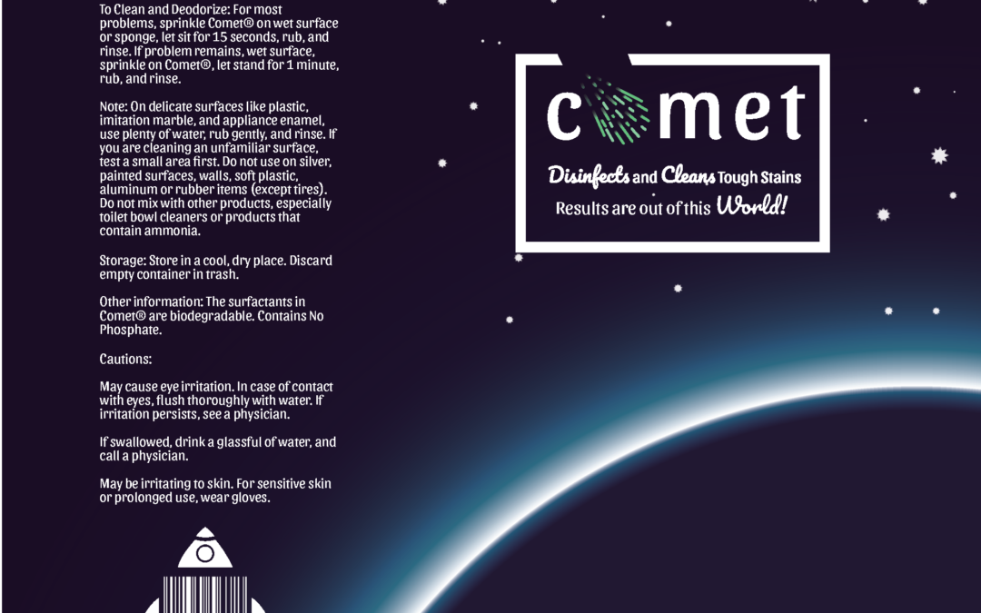
This is my product redesign project. I have taken Comet’s brand and packaging and given it a facelift.
Target Audience:
Younger generation needing household items. I chose this target audience, because I really don’t think the older generation care very much about redesigns, in fact I don’t think older people like to see brands change. I think younger generations though, have an appreciation for it.
Pinterest inspiration:
https://www.pinterest.com/pin/468655904954066571/
https://www.pinterest.com/pin/27092035238575469/
https://www.pinterest.com/pin/76842737361563680/
Chosen Color Scheme: Analagous (Blue-Green, Blue, Blue-Violet) The reason why I chose this color scheme is because I think that it goes well with a space theme which goes well with the brand.

Redesigned logo
![]()
I believe my designs really meet the needs of the redesign justification because I have created a much neater and clean design that will attract the younger generations. Not only have I given it a new slogan that makes sense with their brand name but the design correlates with their brand name as well. I think the information on the back is much more legible and isn’t too busy like most cleaning products. I think that this brand can still be recognized as the cleaner we’ve all known as comet because in the logo the asteroid kind of resembles the bluish-green comet coming out of the shaker. I think this is a design that will generate sales and customers will like to see sitting in their cupboards. I personally, drift towards the more modern-looking designs for cleaners because I think that because they are newer, they may be more effective because things get better through time.
Packaging Process: